
For most Canadians, using cash is a simple part of everyday life. We pull a bank note from our wallet, glance at its value and hand it over without giving much thought to the design that makes those actions possible.
For someone who is blind or has low vision, those same design choices can make the difference between identifying money independently and encountering a barrier.
So, what makes a bank note accessible?
For Canada’s new vertical $20 note, the answer includes tactile features, high-contrast numbers, distinct colours and technology-assisted identification. But just as important is how those features were considered in the first place.
Long before the new $20 was unveiled, CNIB staff and community members with lived experience of sight loss were helping inform the design through CNIB’s long-standing partnership with the Bank of Canada.
Did you know?
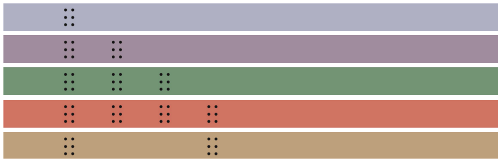
The raised dots on Canadian bank notes are not actually braille.
They are tactile identification features, with a different pattern for each denomination. The $20 note is identified by three six-dot symbols separated by a smooth surface.
And where those symbols appear matters.
Although the new $20 has a vertical visual design, the tactile features remain in a consistent location. For someone who identifies and organizes money by touch, that familiarity can make the note easier and more intuitive to use.
It is exactly the kind of detail that demonstrates why lived experience matters in the design process.
The new $20 at a glance
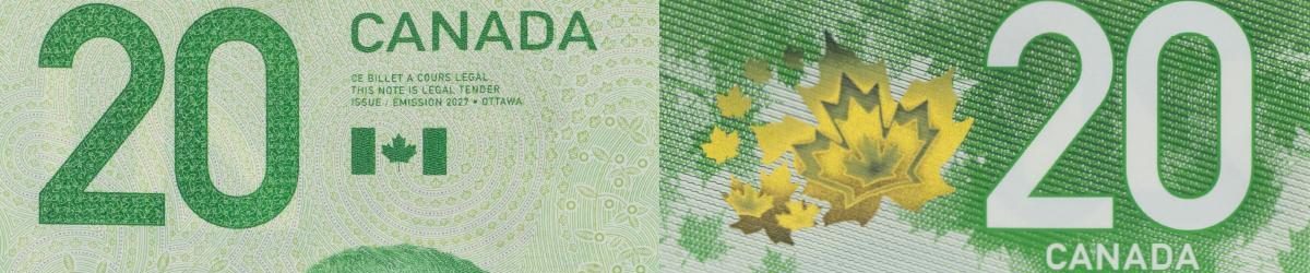
The new note offers several ways for people who are blind or have low vision to identify its value:
- By touch: Three six-dot tactile symbols identify the $20 denomination.
- By sight: A large print, high-contrast “20” appears on both sides of the note, dark green on the front and white on the back.
- By colour: The note remains primarily green and includes a contrasting purple security stripe, making it more easily identifiable as the new $20 note.
- With technology: Smartphone and tablet apps can identify Canadian bank notes, including Seeing AI, which has been evaluated by the Bank of Canada.
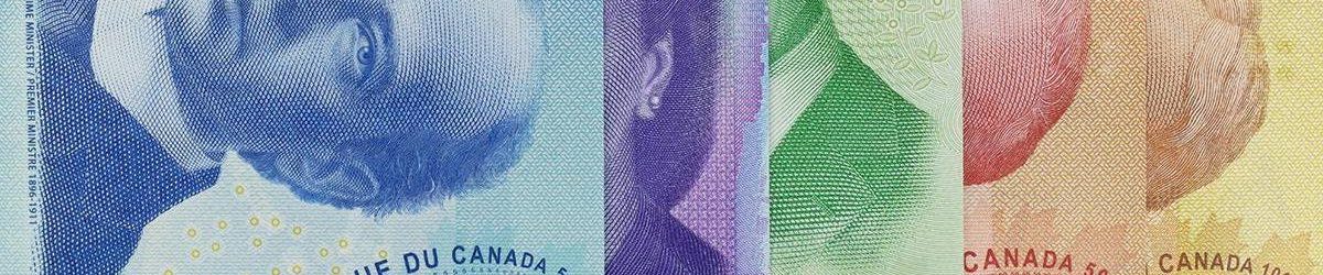
Providing multiple options matters because sight loss is not one experience. What works for one person may not work for another.
A partnership built on listening
CNIB’s role went well beyond reviewing a finished bank note.
Staff and community members with different experiences of sight loss were involved at multiple stages, from early concepts through to proof notes that looked and felt much more like the finished product.
The Bank of Canada asked questions in return, seeking to understand not only what participants needed, but why.
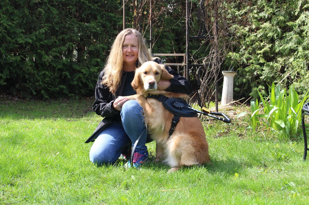
Diane Bergeron, Head of Global Strategies & Senior Vice President, Public Affairs for CNIB, has been involved in consultations on every new Canadian bank note introduced during her time with CNIB since 2012.
For her, one of the things that makes the partnership meaningful is the Bank of Canada’s willingness to keep coming back to people with lived experience.
“They never make the assumption that they have it figured out. Even if the features don’t change, they always consult us on every single bill,” says Bergeron. “That shows a dedication to lived experience and to making sure they’re getting real feedback from the people they’re designing for.”
Inclusive design in practice
The unveiling of the new $20 note is an opportunity to celebrate the CNIB staff and community members who shared their knowledge and lived experience to help make Canadian currency more accessible.
It is also an example of what meaningful inclusive design can look like.
Accessibility is strongest when people with disabilities are part of the process while decisions are still being made. The process behind the new $20 note demonstrates the value of bringing people with lived experience in early, seeking out different perspectives and keeping that expertise part of the conversation as the work evolves.
Want to learn more?
Explore the Bank of Canada’s resources for identifying Canadian bank notes for more information about accessibility features and tools for people who are blind or have low vision.